Font Weights
Learn how to use font weights in UI design to create hierarchy, improve legibility, and enhance the user experience.
0%
Classes

Mastering Font Weights in Figma
16:48
16:48
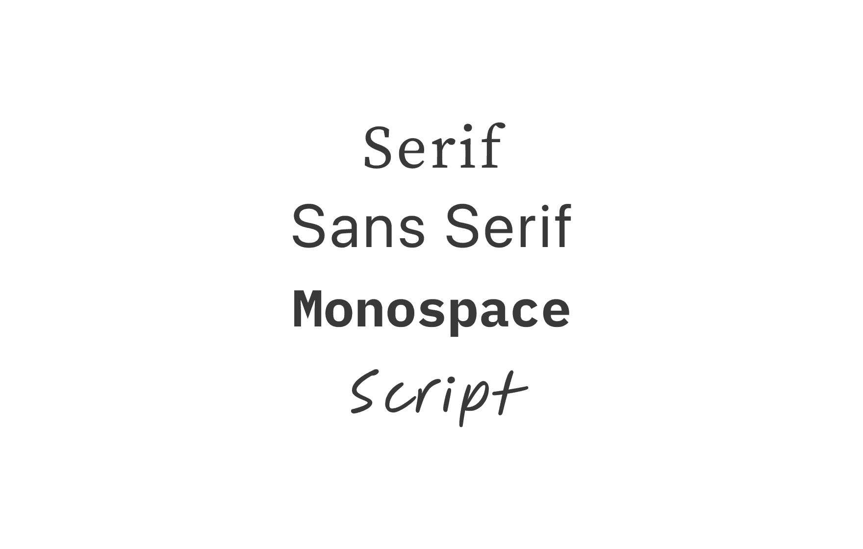
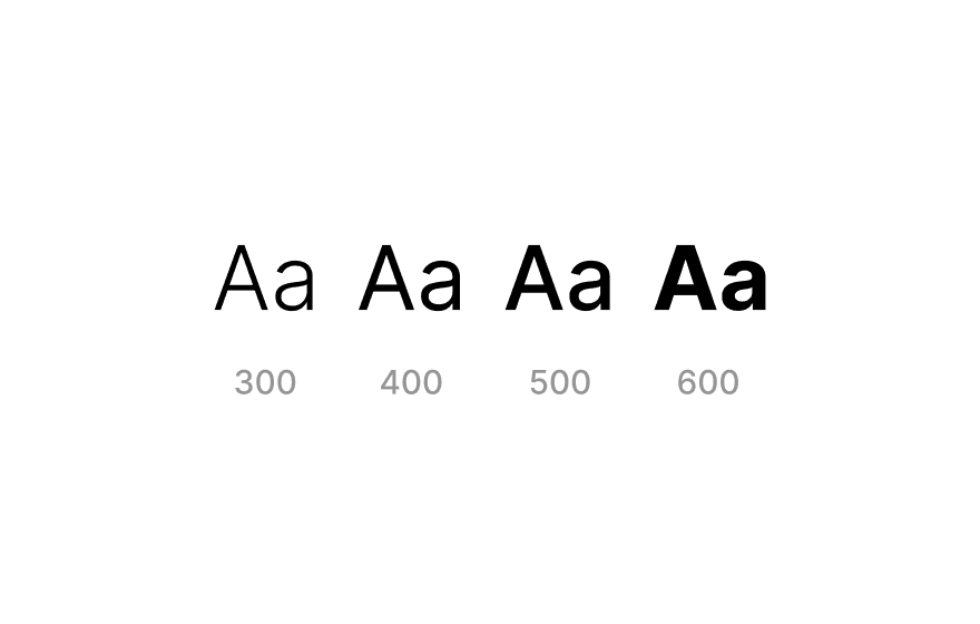
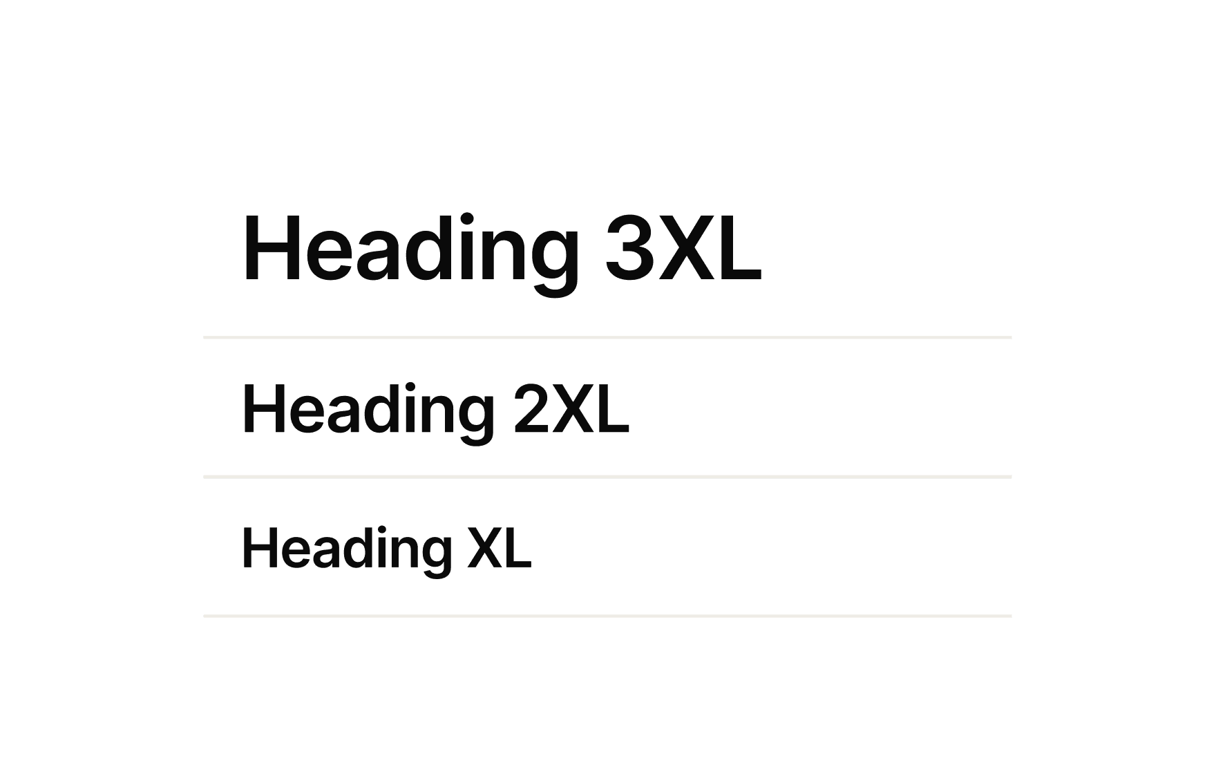
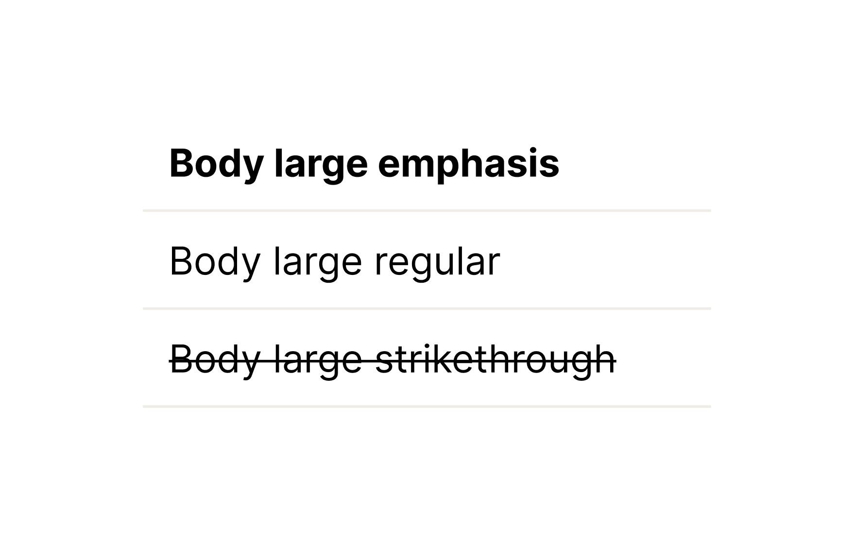
Using Font Weights in UI
This course explores how to apply font weights strategically in UI design. You'll learn when to use light, regular, medium, bold, and extra bold weights to establish hierarchy, guide attention, and improve readability across screens. We’ll cover best practices for responsive typography, accessibility, and maintaining visual consistency in design systems.
Course certificate

Font Weights
Course certificate
Font Weights
Master Typography in UI Design
6 courses · beginner