Framer Responsive Navbar
Learn how to make your navigation bar fully responsive across all screen sizes using layout and breakpoints in Framer.
0%
Classes
Achieving Perfect Responsiveness on Framer
09:50
09:50
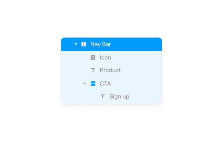
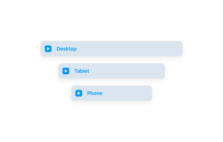
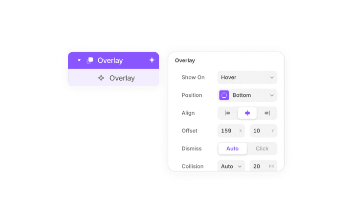
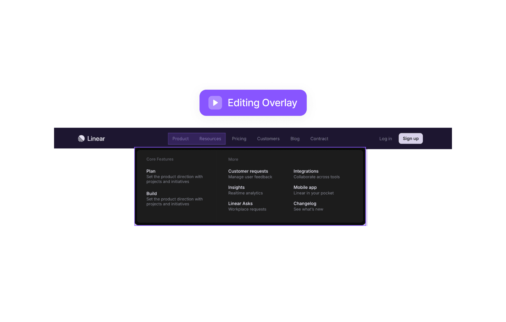
Make Your Navbar Responsive In Framer
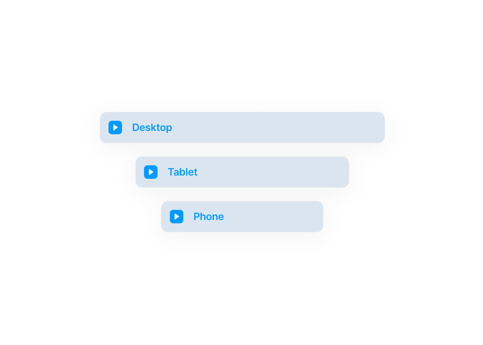
In this course, you’ll learn how to make your nav bar responsive using Framer’s layout tools and breakpoints. We’ll cover how to adjust elements across devices, use stacks effectively, and create adaptive navigation systems. By the end, your navbar will look great on any screen size.
Course certificate

Framer Responsive Navbar
Course certificate
Framer Responsive Navbar
Design a Responsive Navbar in Framer
4 courses · beginner