Spotify Base Components
Learn how to audit and set up reusable Spotify UI components in Figma—starting with navbars, buttons, and a solid system.
0%
Classes
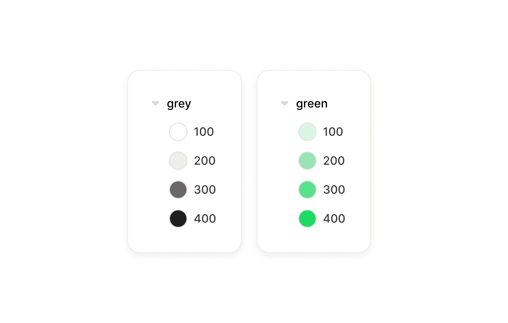
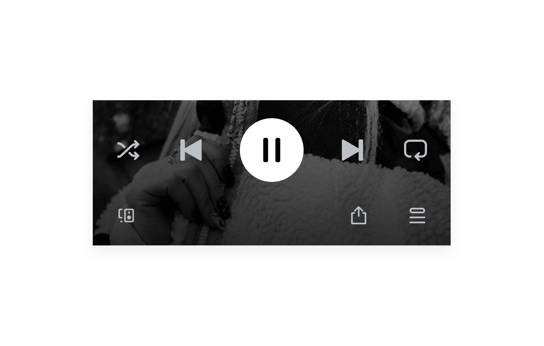
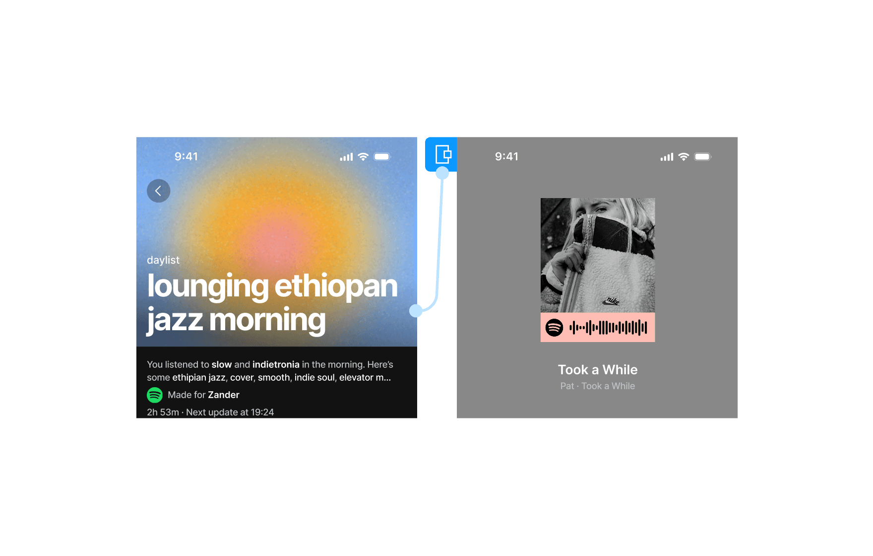
Auditing Spotify's Component Range
07:32
07:32
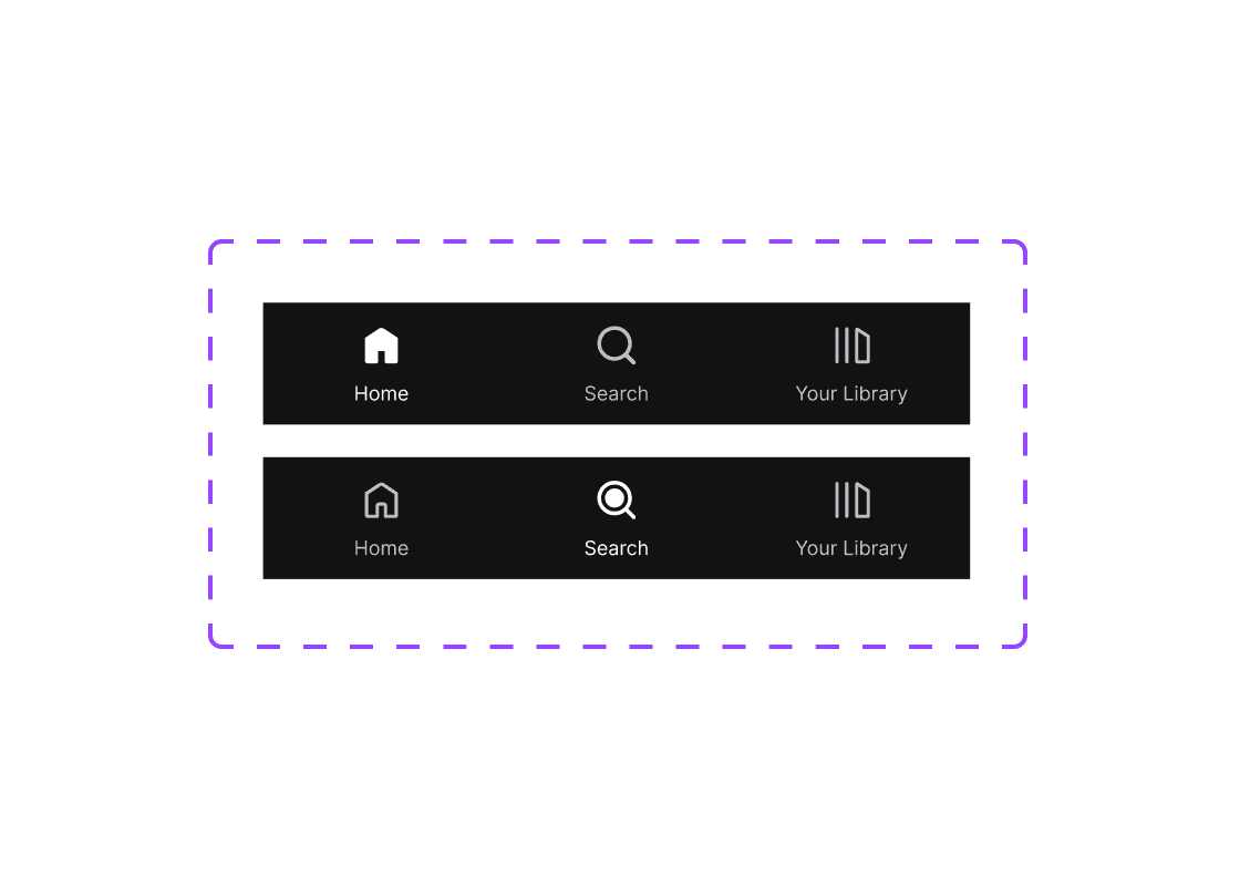
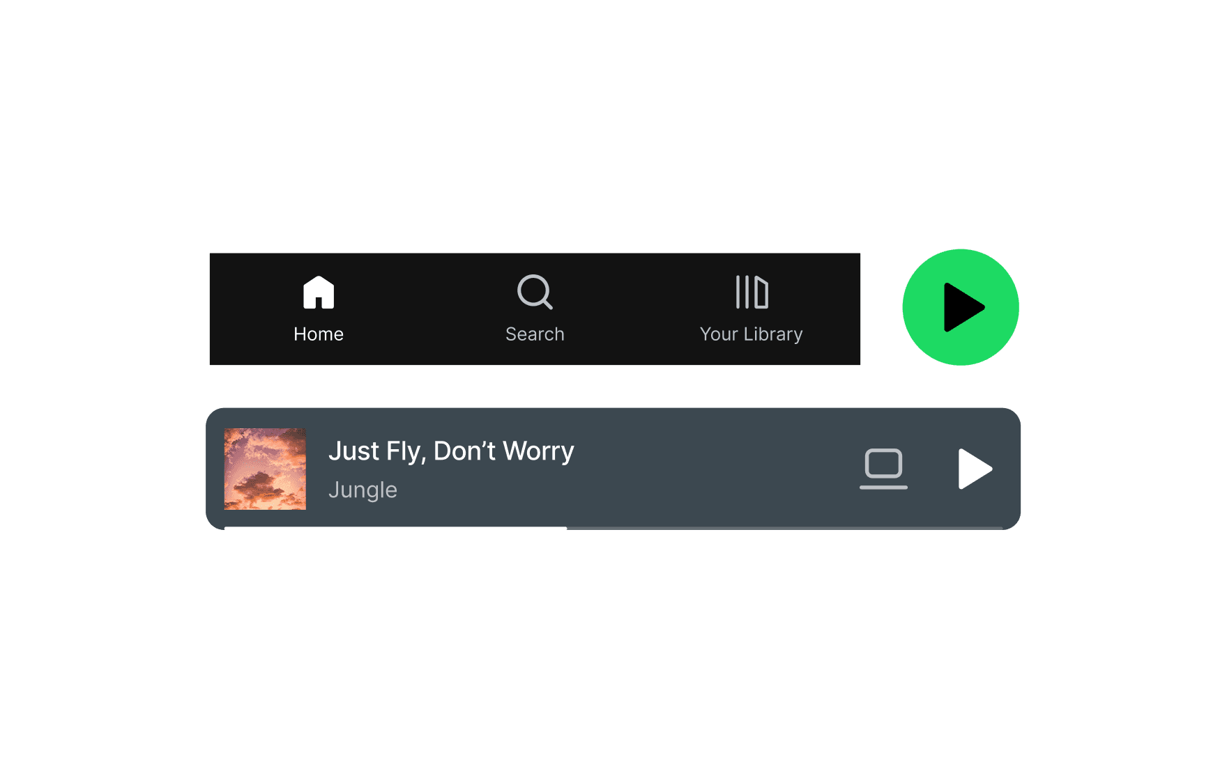
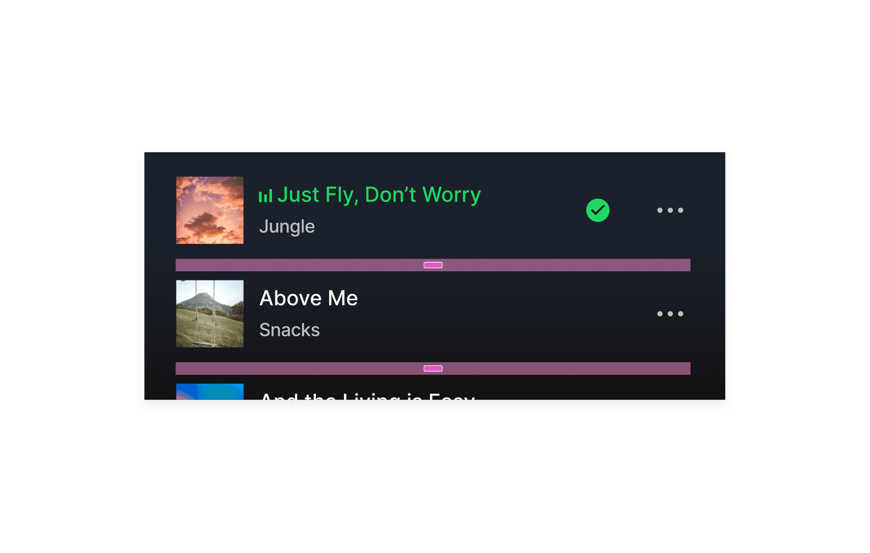
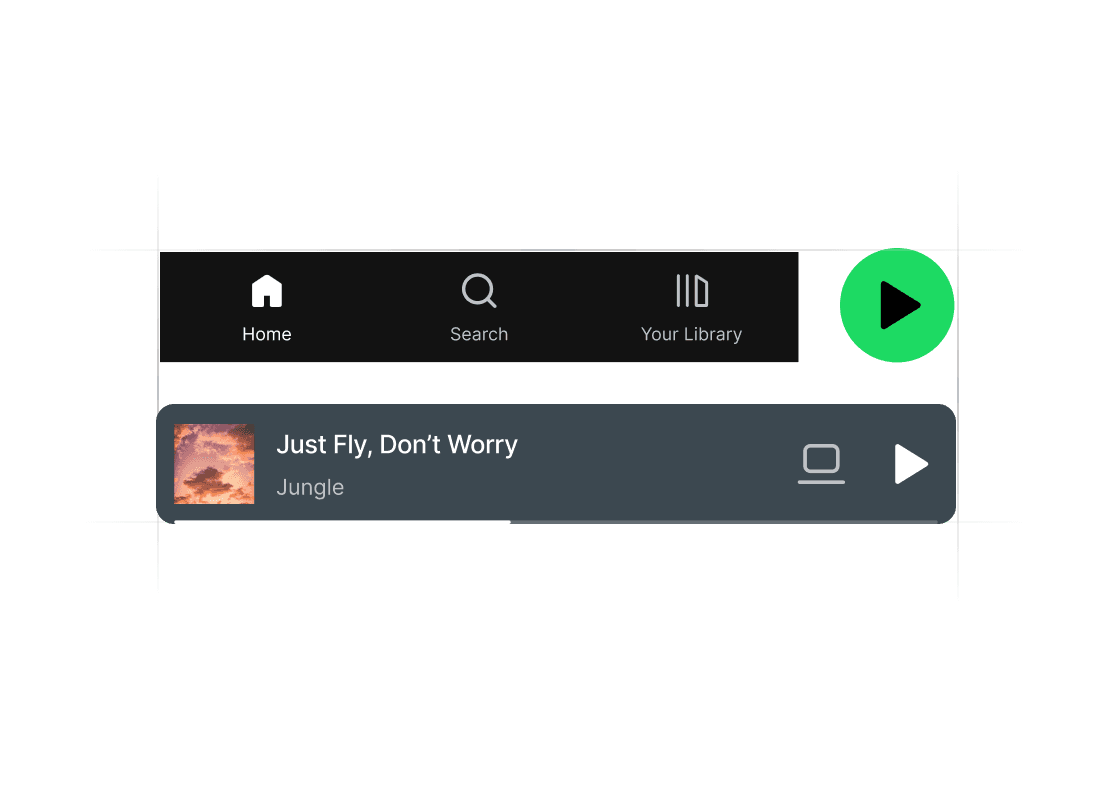
Creating Spotify's Auto Layout Navbar Component
08:30
08:30
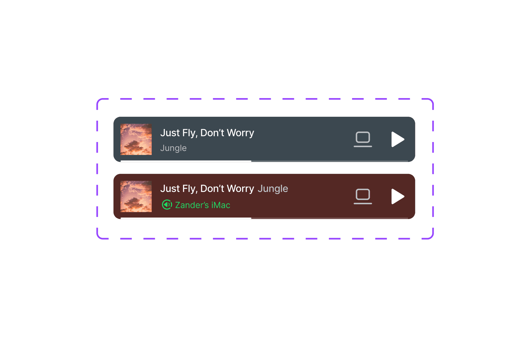
Creating Spotify's Button Components in Figma
10:53
10:53
Building Spotify Foundation Components
In this course, you'll start by conducting a component audit to assess what’s needed for Spotify’s UI. You’ll then create key reusable components like the navbar and button set, all structured using Auto Layout in Figma. This is your essential first step before diving into more advanced interface building.
Course certificate

Spotify Base Components
Course certificate
Spotify Base Components
Design & Build Spotify iOS in Figma
6 courses · intermediate