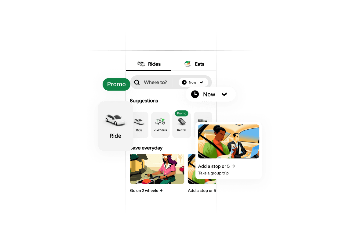
Uber Base Components
Learn to design UI components for the Uber app, mastering Auto Layout, variants, and reusable structures in Figma.
0%
Classes
Uber: Conducting A Component Audit
09:32
09:32
.png&w=3840&q=75)
Uber: Underline Tabs Component Set
10:08
10:08
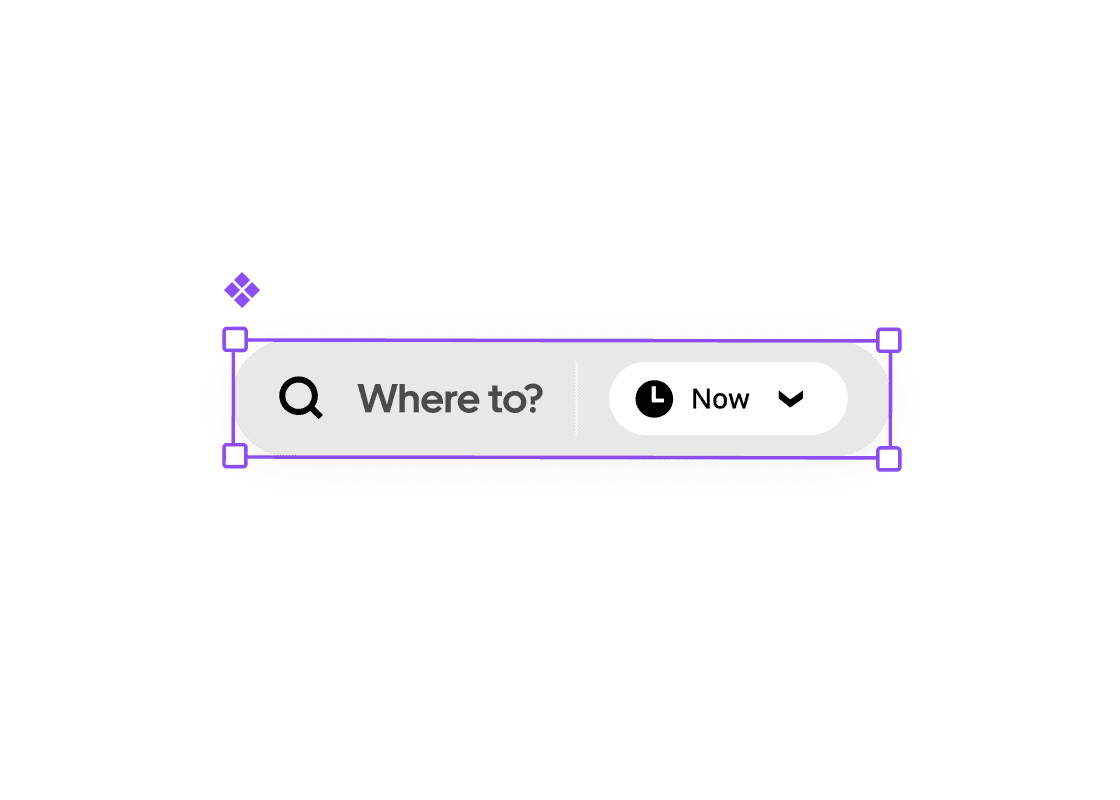
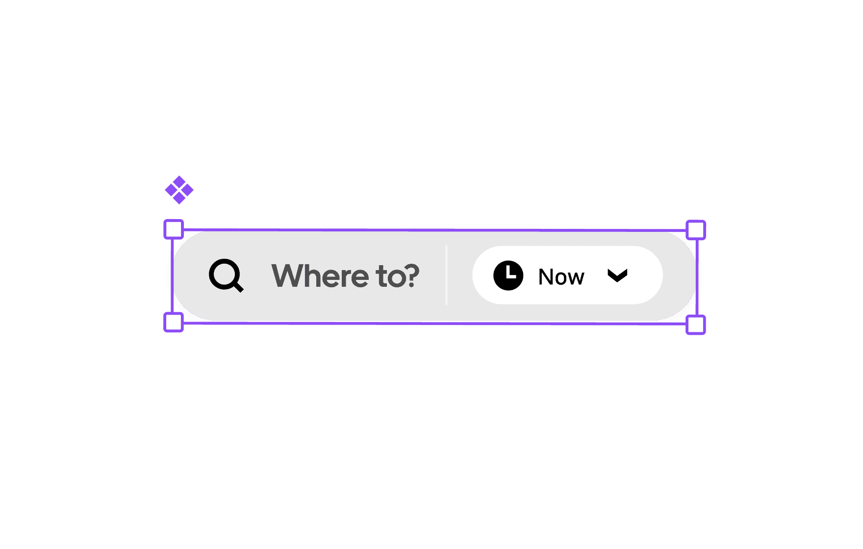
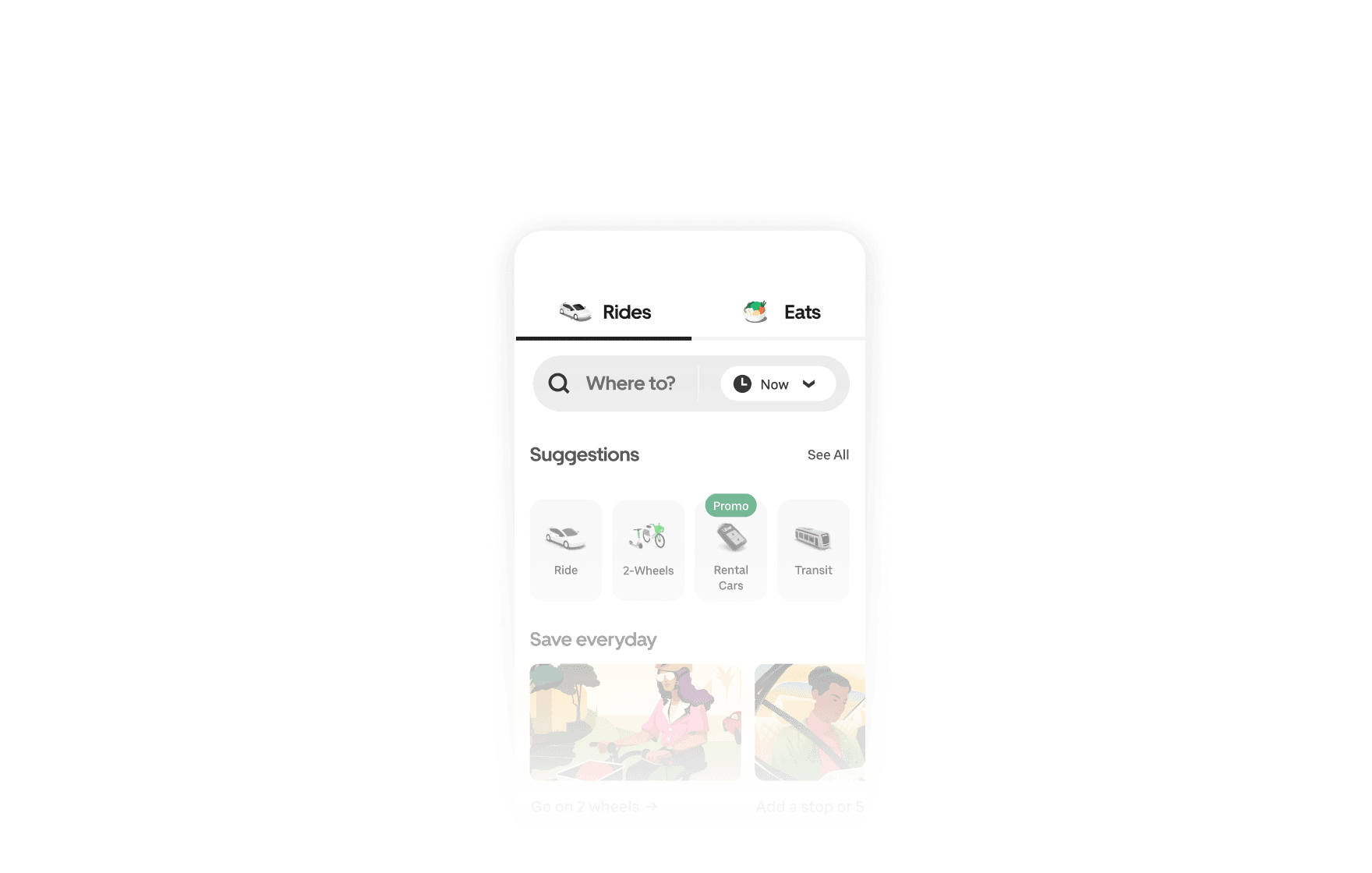
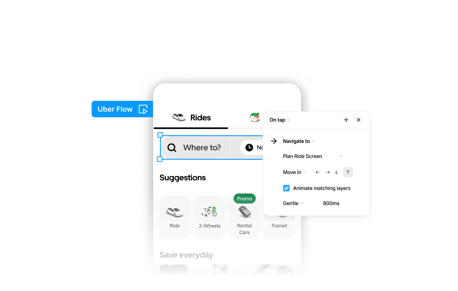
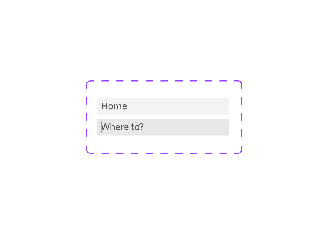
Uber: Search Bar Component
11:35
11:35
.png&w=3840&q=75)
Uber: Cards Components
32:46
32:46
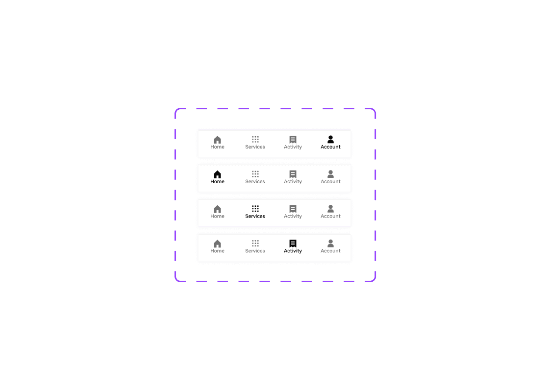
Uber: Navbar Component Set
08:31
08:31
Uber: Chip Components
23:04
23:04
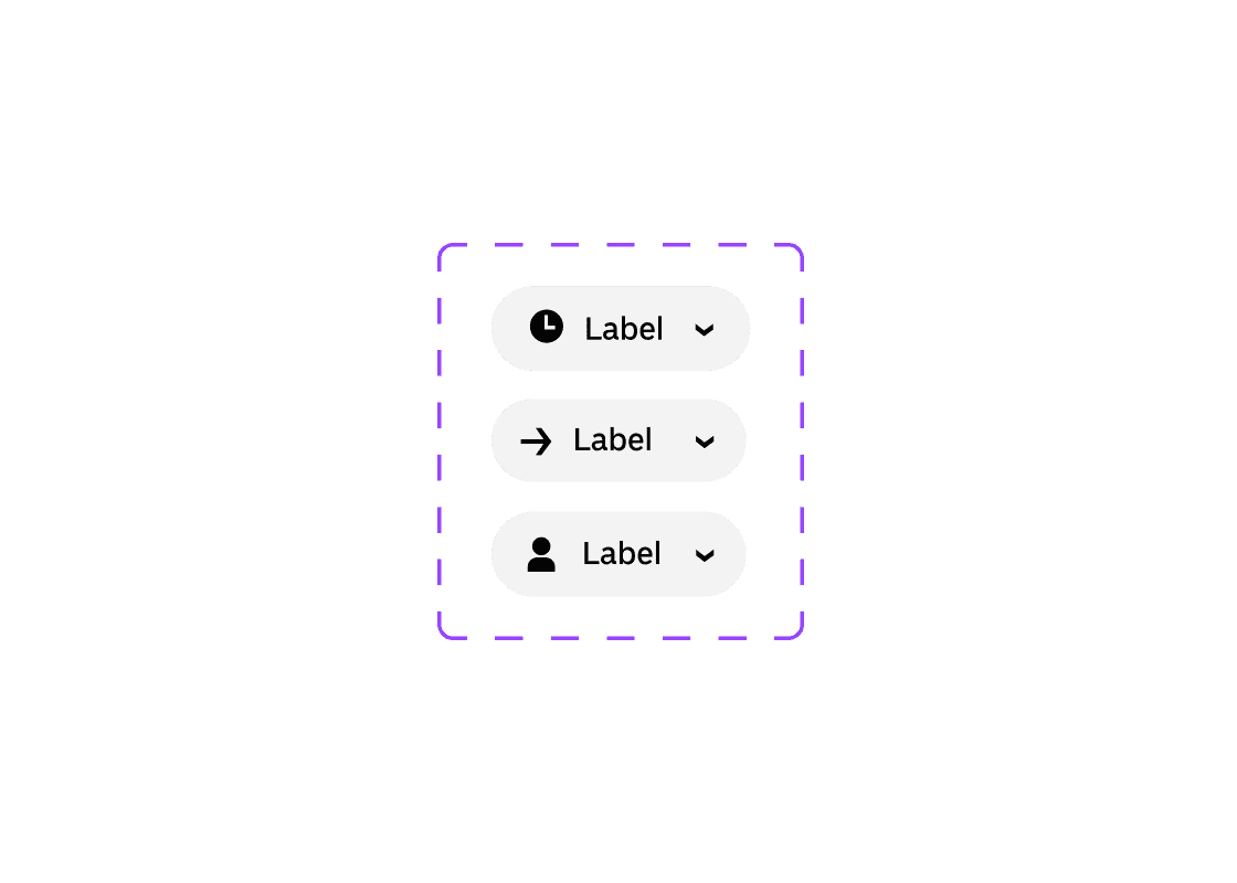
Uber: Input Fields Component Sets
14:52
14:52
.png&w=3840&q=75)
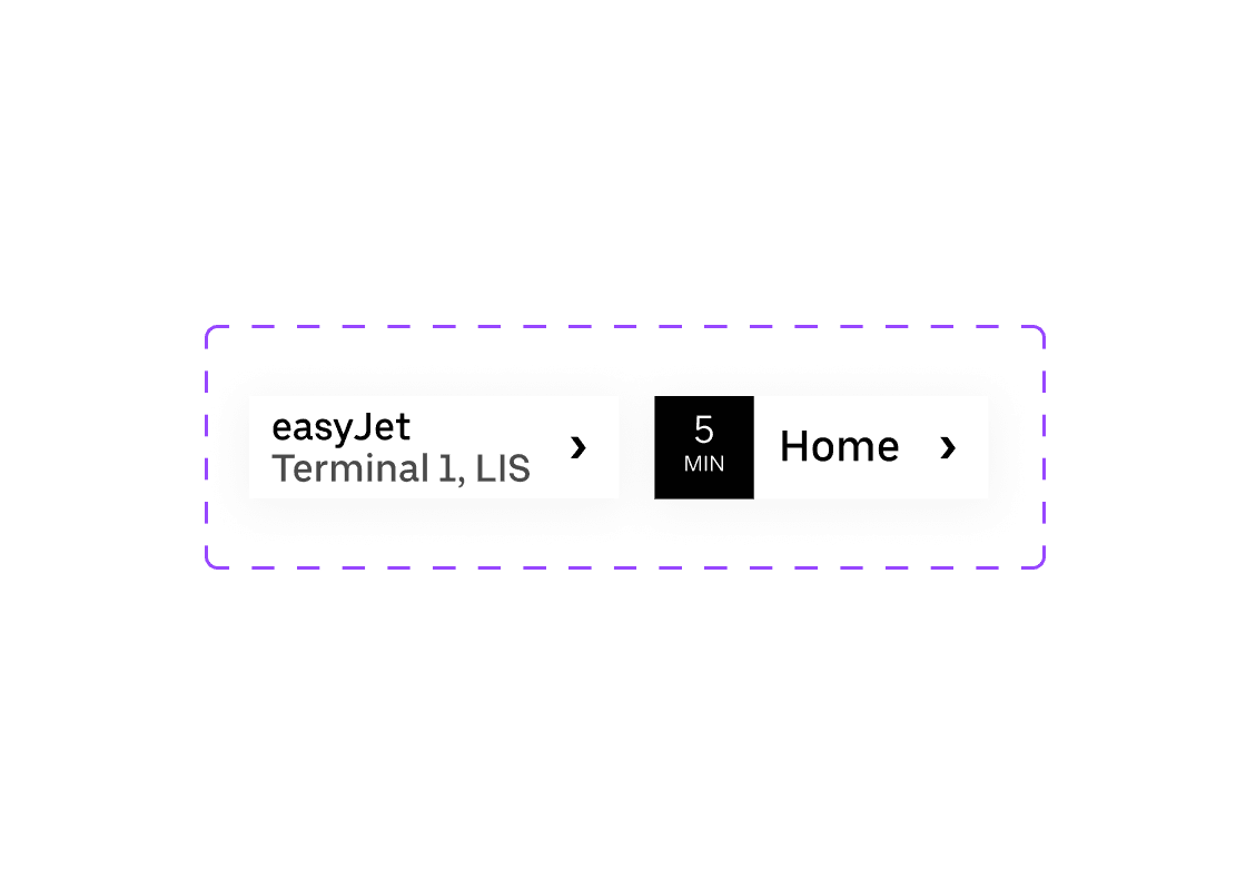
Uber: List Item Components
31:28
31:28
Uber: Buttons Components
21:02
21:02
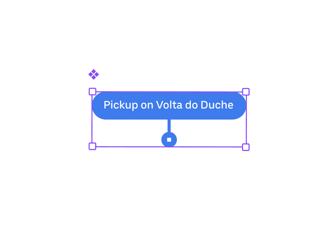
Uber: Location Pin Component
03:02
03:02
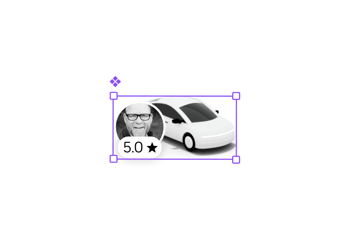
Uber: Driver Avatar Component
02:35
02:35
Master Designing Uber Components with Auto Layout
This course focuses on practicing the design of key UI components used in the Uber app. Through hands-on exercises, you will recreate buttons, list items, cards, and other interactive elements while maintaining consistency with Uber's design system.
Course certificate

Uber Base Components
Course certificate
Uber Base Components
Design & Build Uber Android in Figma
4 courses · intermediate