Headspace Base Components
Learn to design UI components for the Headspace app, mastering Auto Layout, variants, and reusable structures in Figma.
0%
Classes
.png&w=3840&q=75)
Headspace: Conducting A Component Audit
04:07
04:07
.png&w=3840&q=75)
Headspace: Dropdowns Component Set
03:56
03:56
.png&w=3840&q=75)
Headspace: List Item Component
06:22
06:22
.png&w=3840&q=75)
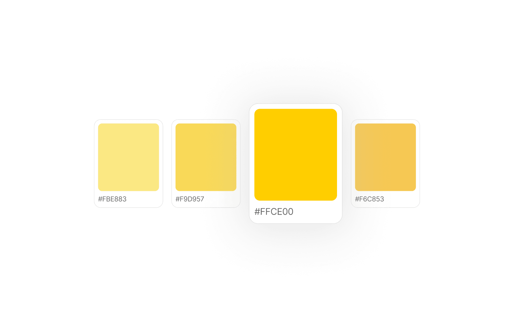
Headspace: Progress Bar Component Set
07:26
07:26
.png&w=3840&q=75)
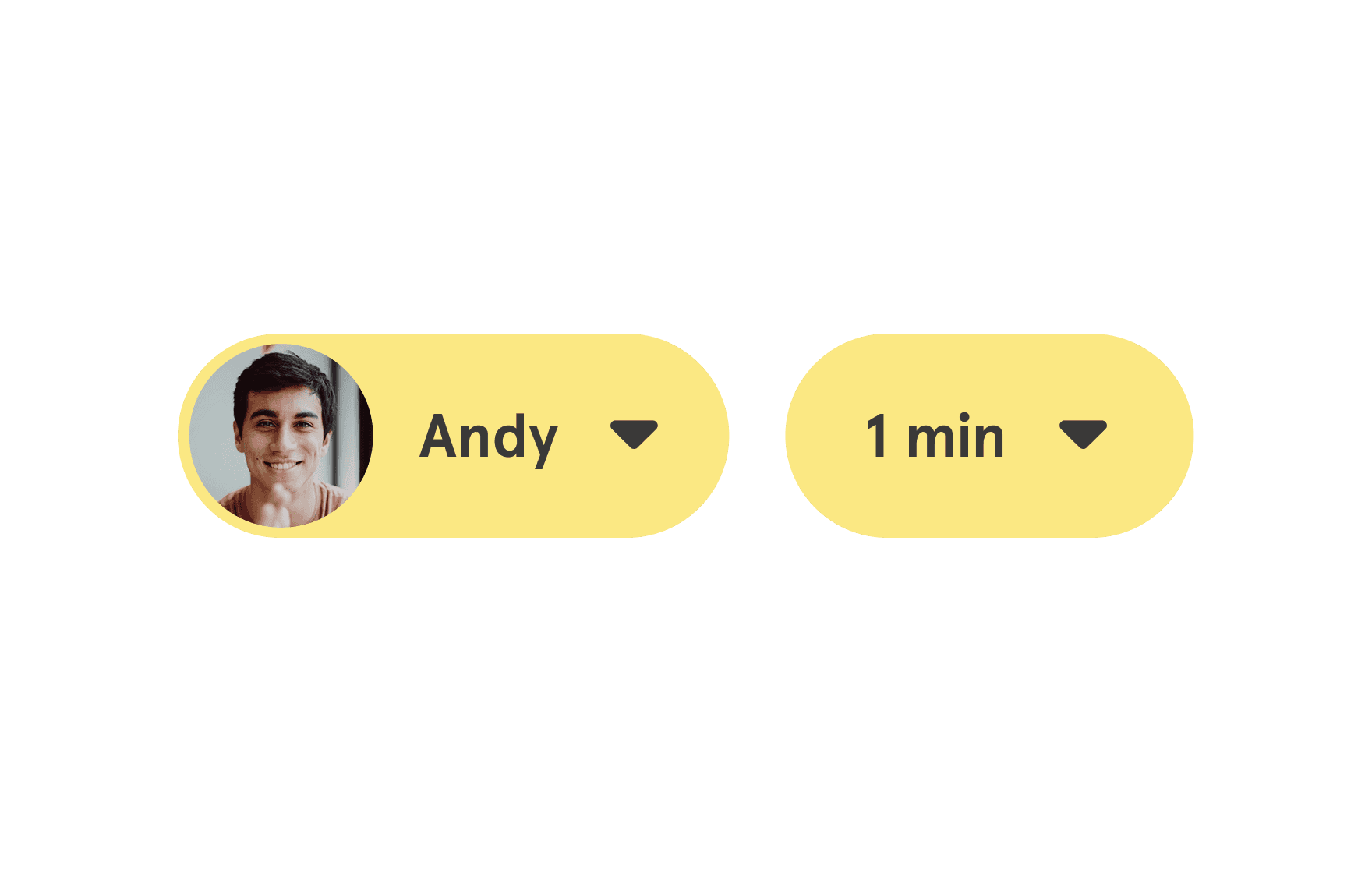
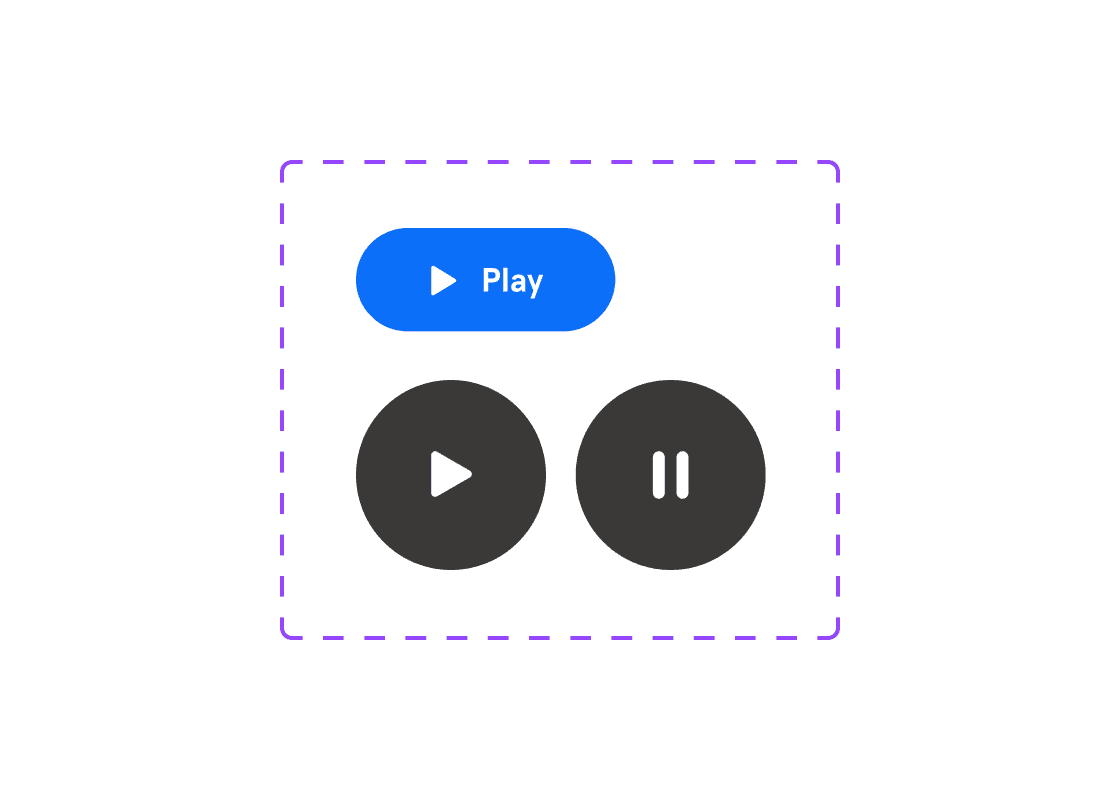
Headspace: Controls Component
03:55
03:55
.png&w=3840&q=75)
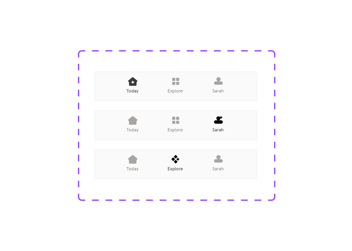
Headspace: Underline Tabs Component Set
06:20
06:20
.png&w=3840&q=75)
Headspace: Tag Component
01:46
01:46
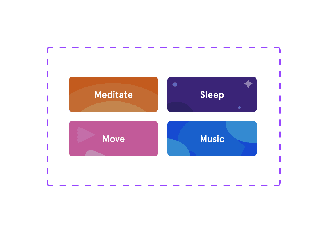
Headspace: Cards Components
36:53
36:53
.png&w=3840&q=75)
Headspace: Search Bar Component
04:19
04:19
Headspace: Creating Headspace Button Component Set
14:00
14:00
Headspace: Creating Auto Layout Navbar Component Set
11:14
11:14
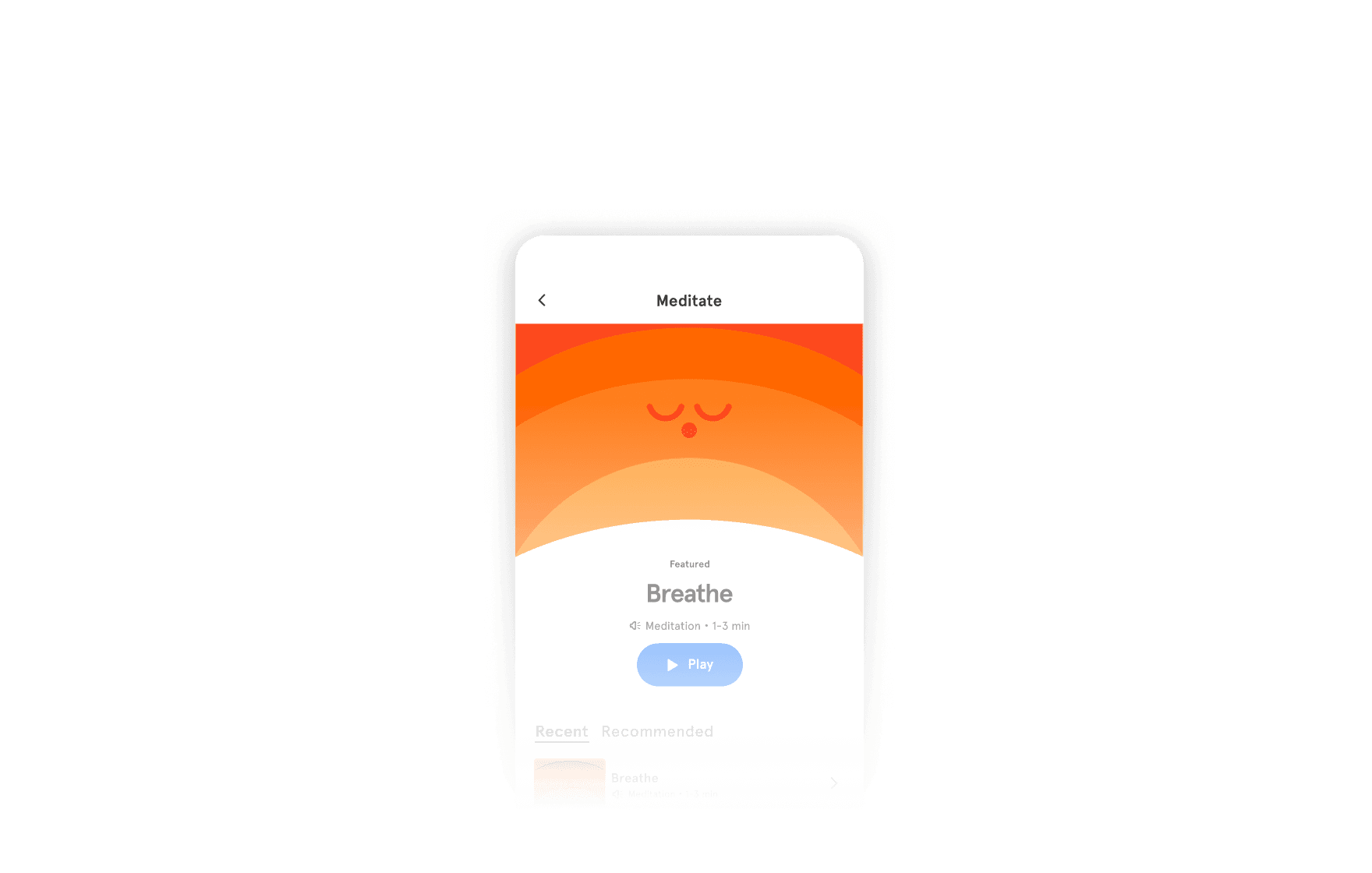
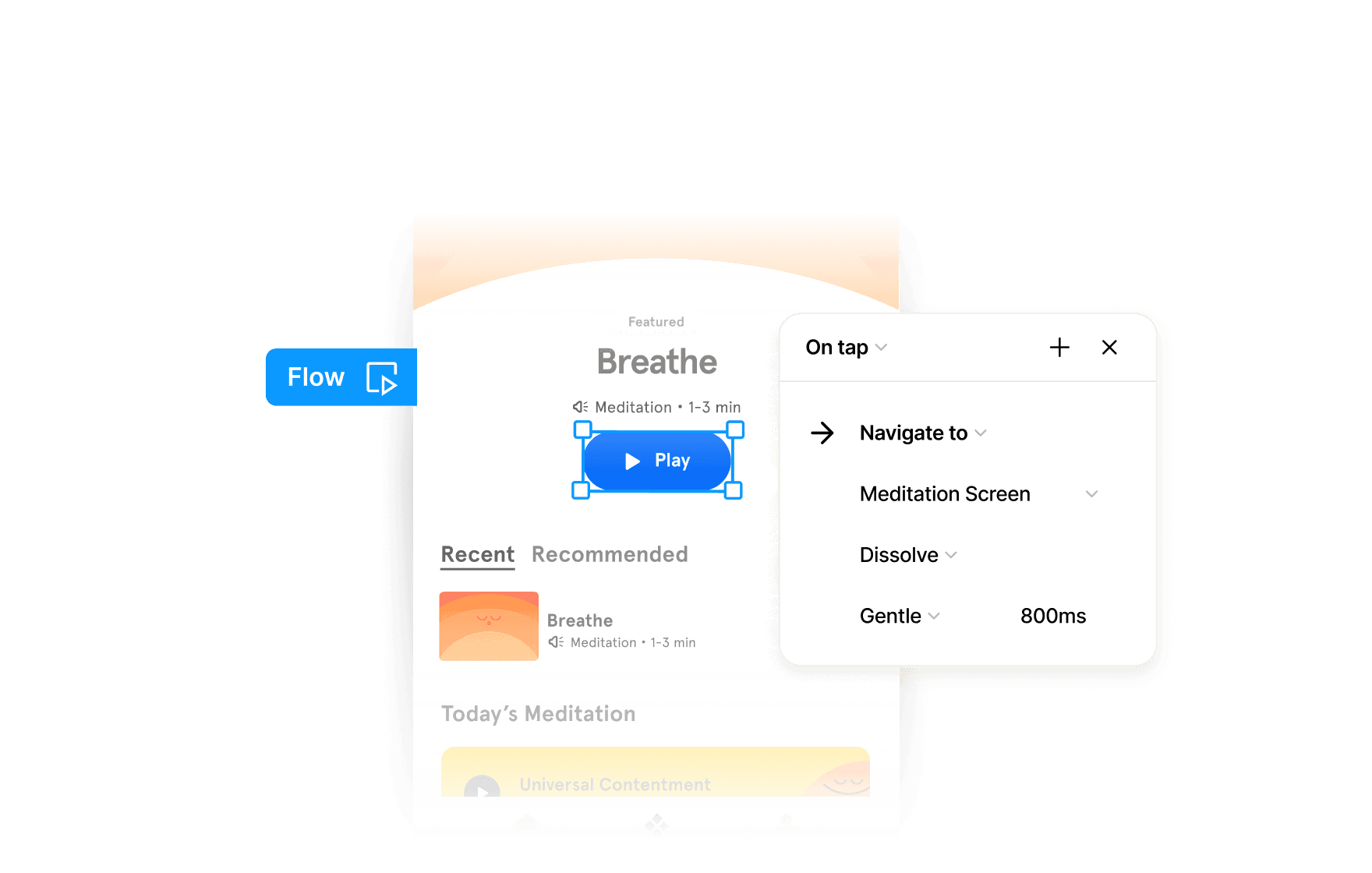
Master Designing Headspace Components with Auto Layout
This course focuses on practicing the design of key UI components used in the Headspace app. Through hands-on exercises, you will recreate buttons, list items, cards, and other interactive elements while maintaining consistency with Headspace's design system.
Course certificate

Headspace Base Components
Course certificate
Headspace Base Components
Design & Build Headspace iOS in Figma
4 courses · intermediate